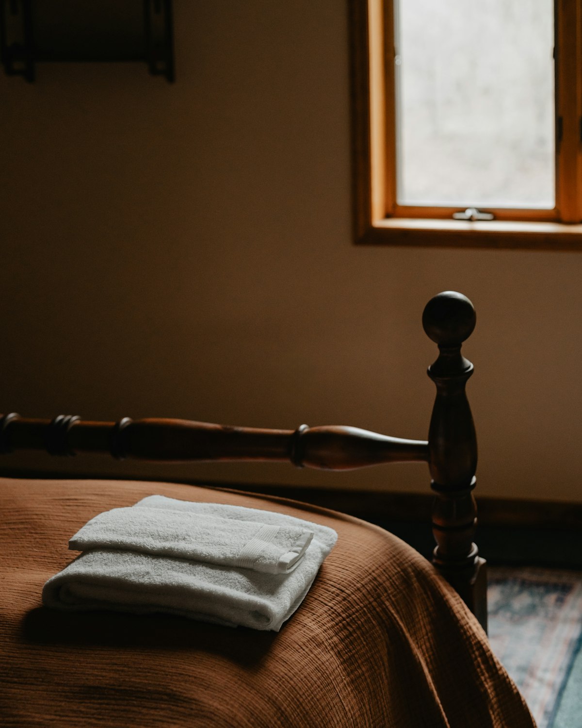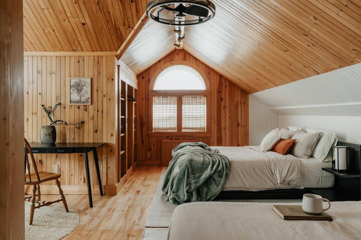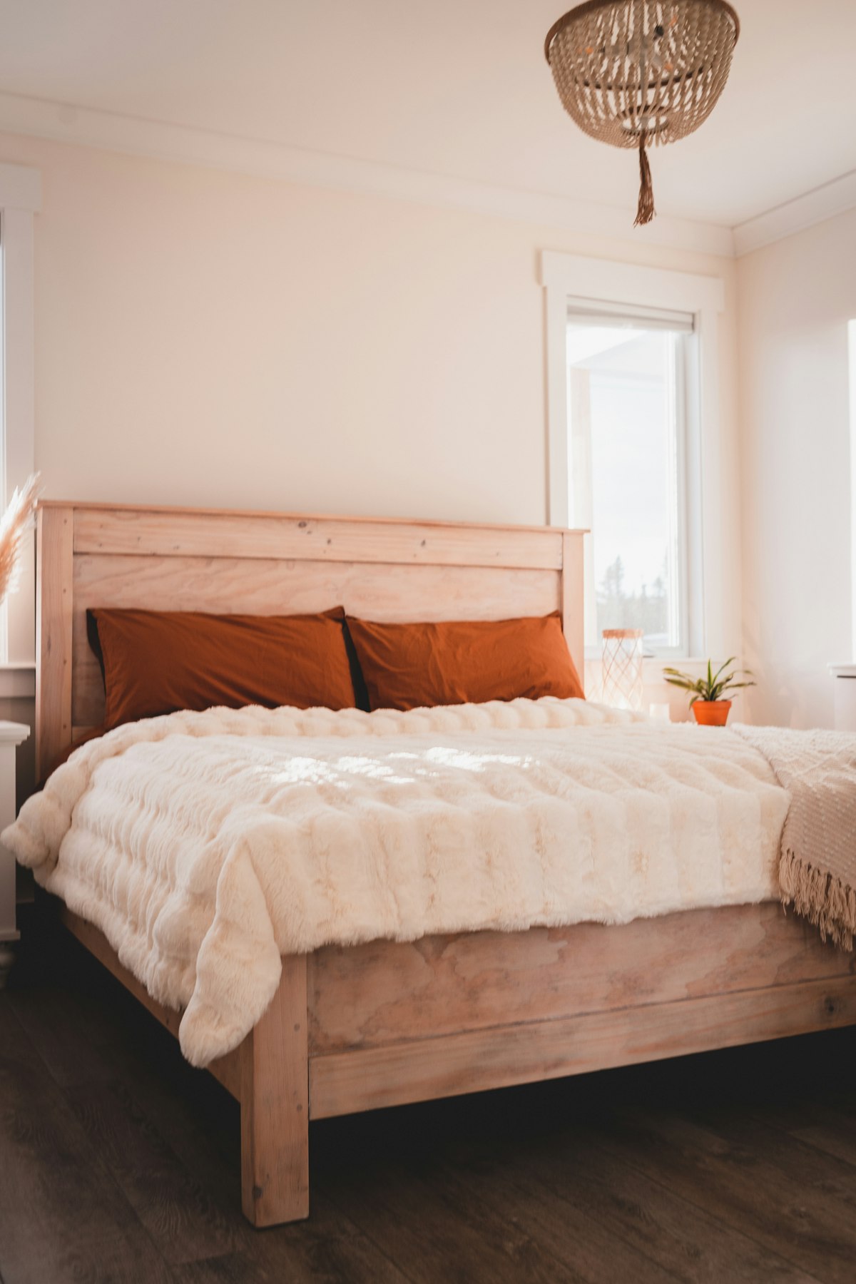
Begin with fixed surfaces such as flooring and the largest furniture. Choose wall and textile colours that sit comfortably with them. A calm room can use colour, but a smaller family of related tones often creates a more settled overall effect.
Make large paint samples and view them near the bed and window. Light changes the appearance through the day and bedside lamps alter it again at night. Compare bedding samples at the same time so the palette is decided together.
Define what calm means in your room before selecting colours. Some people prefer pale surfaces, while others find deeper muted tones more comfortable. Look at how much daylight the bedroom receives and what you see from the bed. The palette should respond to those conditions instead of assuming that a particular fashionable shade is relaxing in every space.
Identify the undertones of retained materials, especially a large timber wardrobe or strongly coloured floor. Put paint samples beside these surfaces rather than viewing them on a clear white background. A neutral that seems simple in the shop may emphasize an unwanted pink or yellow cast at home. Test the combination before choosing bedding to match it.
Paint sample boards large enough to judge the effect and move them around the room. View one beside the window and another where the wall is shaded. Check them again under the bedside lamps you normally use. Record the product and finish as well as the colour, because changing the surface sheen can alter how the same shade appears.
Reduce competing colour families before buying new furniture. A room with several different timber finishes may need a quieter textile scheme rather than another strong accent. Repeating a warm cream or muted green in a few places can connect existing items. The repetition can be subtle, using related tones rather than an exact match across every surface.
Use contrast where it has a practical or visual purpose. A darker bedside table can give definition against a pale wall, while a patterned cushion can connect two colours already present. Keep the strongest contrast away from areas you want to feel visually quiet. Try movable textiles first if you are unsure about committing to a large painted or upholstered element.
Check the maintenance of the chosen finishes before the final purchase. A delicate wall surface or textile may create more concern than the mood it provides. Follow paint preparation and curing guidance, and do not cover active dampness with a new colour. Keep the final sample group together so later additions can be assessed against the same reference.
Keep a record of the colours that were rejected as well as the final choice. A later purchase may recreate the same unwanted contrast, and a brief note about the room light can explain why an attractive sample did not work there.
Use texture to provide interest when the colour range is quiet. Choose paint for the substrate and expected maintenance, following its preparation guidance. The most useful palette is one you enjoy under real room conditions rather than only in a bright inspiration image.
Check dimensions against your room and follow furniture anchoring, textile care and electrical safety instructions. Use a competent installer for uncertain wall fixings and appropriately qualified help for permanent service changes.