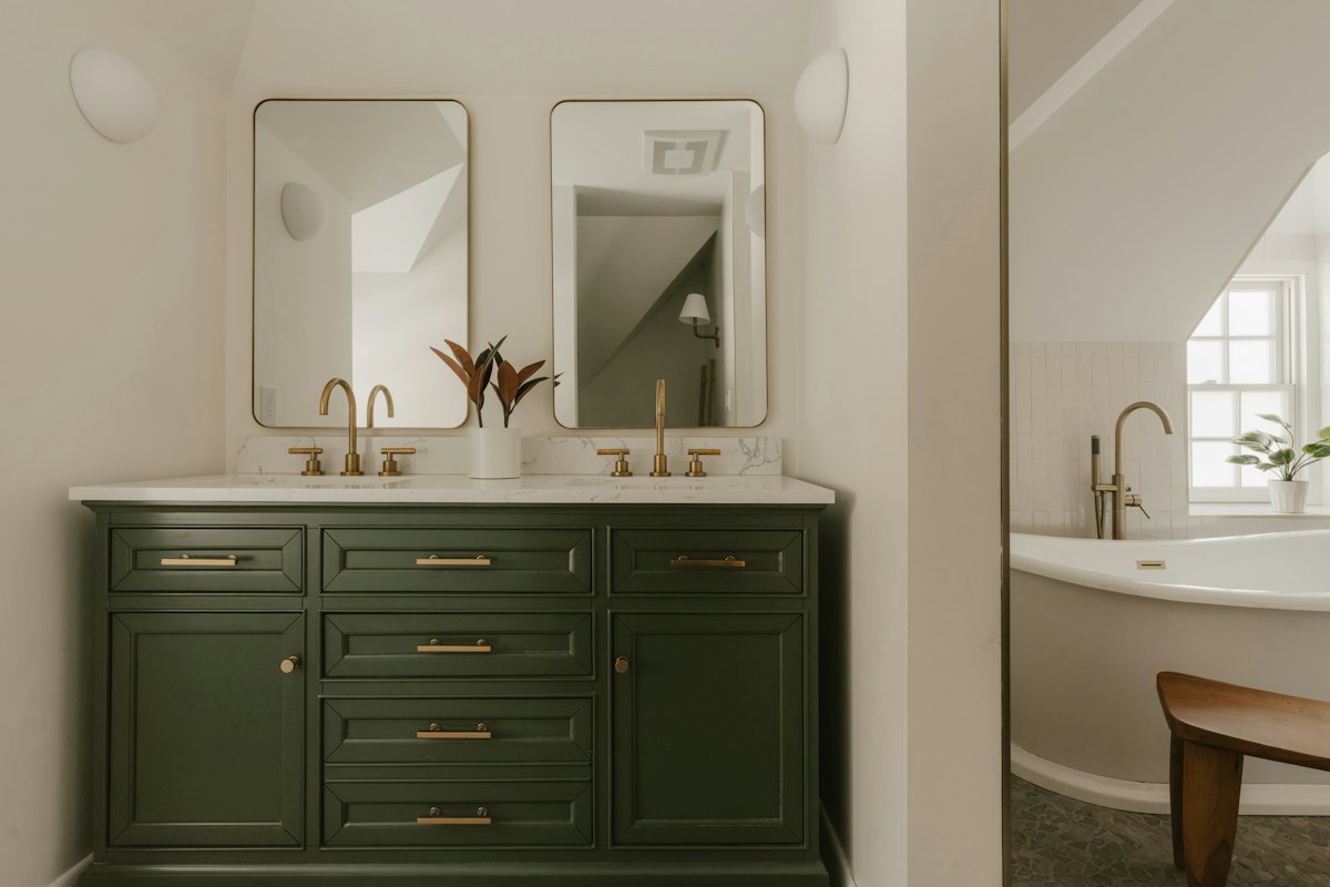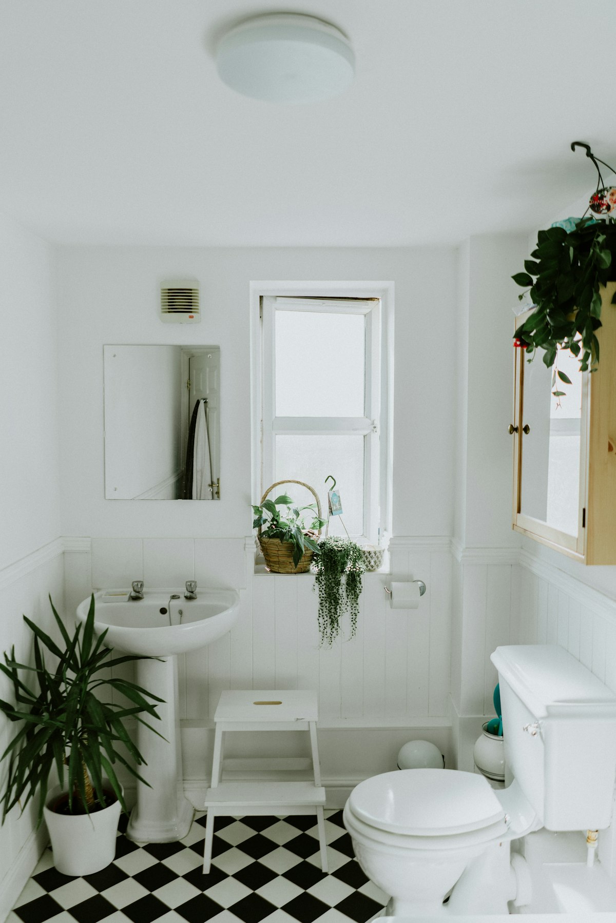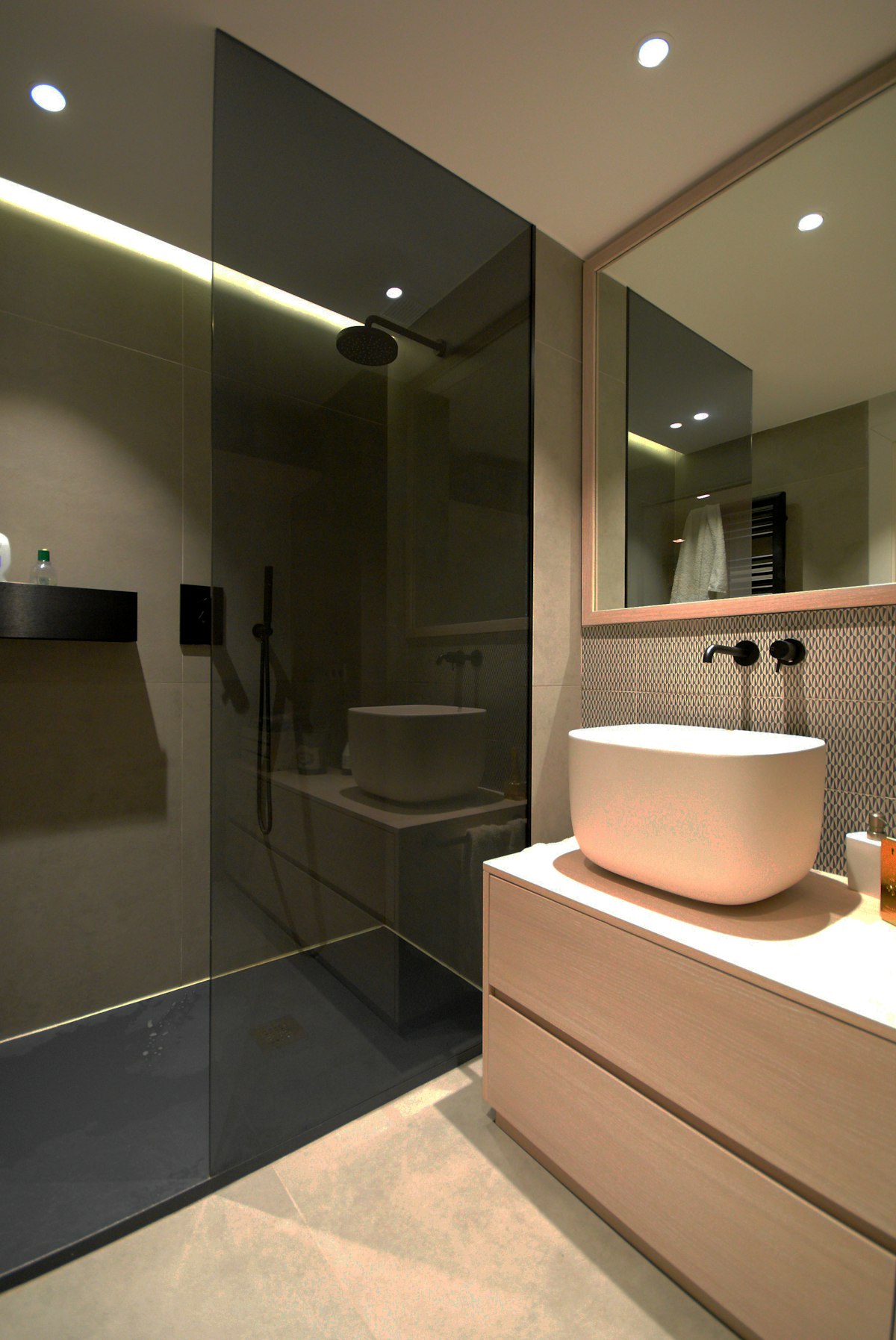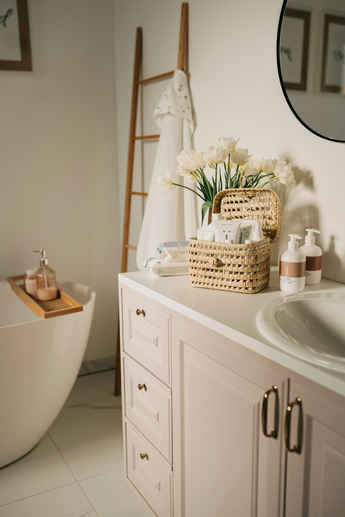
Treat the tile as a fixed part of the palette and identify whether its undertone feels warm or cool. Test paint beside both the tile and grout. A colour that looks neutral on its own can make an existing finish appear unexpectedly pink, yellow or grey.
Make larger samples and view them with the bathroom lighting switched on. The mirror and shiny surfaces can reflect colour into other parts of the room. Keep the palette restrained when the existing tile already has a strong pattern.
Select a paint system suitable for the substrate and moisture exposure. Follow preparation and curing instructions and address dampness before decorating. A well judged wall colour can connect older fixtures without pretending that paint is a repair for underlying damage.
Study the tile in ordinary bathroom light before naming its undertone. Compare it with a plain white reference and with the basin, since the tile may look different beside each. A grey surface can lean toward green or violet, while a beige may contain a pink cast that becomes noticeable only beside another neutral. You do not need an elaborate colour theory system. The useful goal is to recognize which neighbouring colours make the existing tile look comfortable.
Try a small selection of genuinely different paint directions rather than many near identical whites. A warmer neutral, a muted colour related to the tile and a lighter version of the existing wall may reveal the most promising approach. Make broad samples that can be viewed together with the grout and vanity. Keep the sample surface separate from areas needing repair so colour judgement is not confused by uneven preparation or damp patches.
Observe the samples at the time the bathroom is normally used. A windowless room is mainly judged under artificial light, whereas a room with strong daylight can change substantially between morning and evening. Reflections from a mirror or coloured towels may alter the impression too. Keep the evaluation close to ordinary conditions. A shade that looks convincing only in a bright shop is a weak basis for choosing the walls of a dim bathroom.
Consider how much contrast the room needs. A wall close to the tile colour can make the boundary quieter, while a deliberate contrast may give older tile a clearer place in the design. Neither option requires every accessory to match. Try the wall sample beside a towel or a cabinet finish that will remain. A small group of coordinated elements can make the room feel considered without replacing serviceable fixtures simply because their colour is no longer fashionable.
Confirm the appropriate paint system once the colour direction is settled. The substrate, preparation and moisture exposure matter as much as the shade. Follow the product guidance for application, ventilation and curing, and have unexplained dampness assessed before decorating. Keep the colour reference for later touch ups. The completed wall should connect the retained materials visually while remaining honest about the condition and performance of the surfaces underneath.
A bathroom must be assessed as a complete installation. Confirm product suitability, waterproofing, ventilation and applicable local requirements with qualified installers before beginning work or purchasing fitted components.