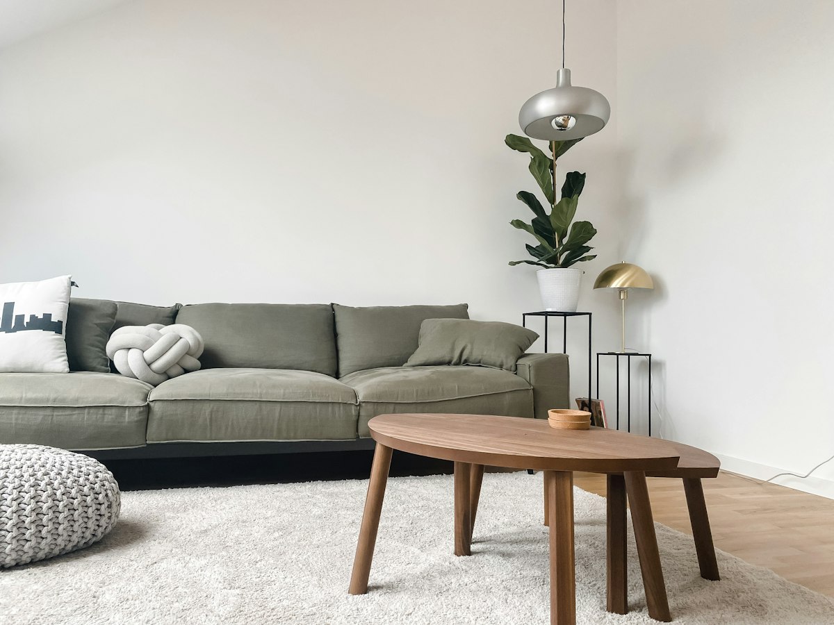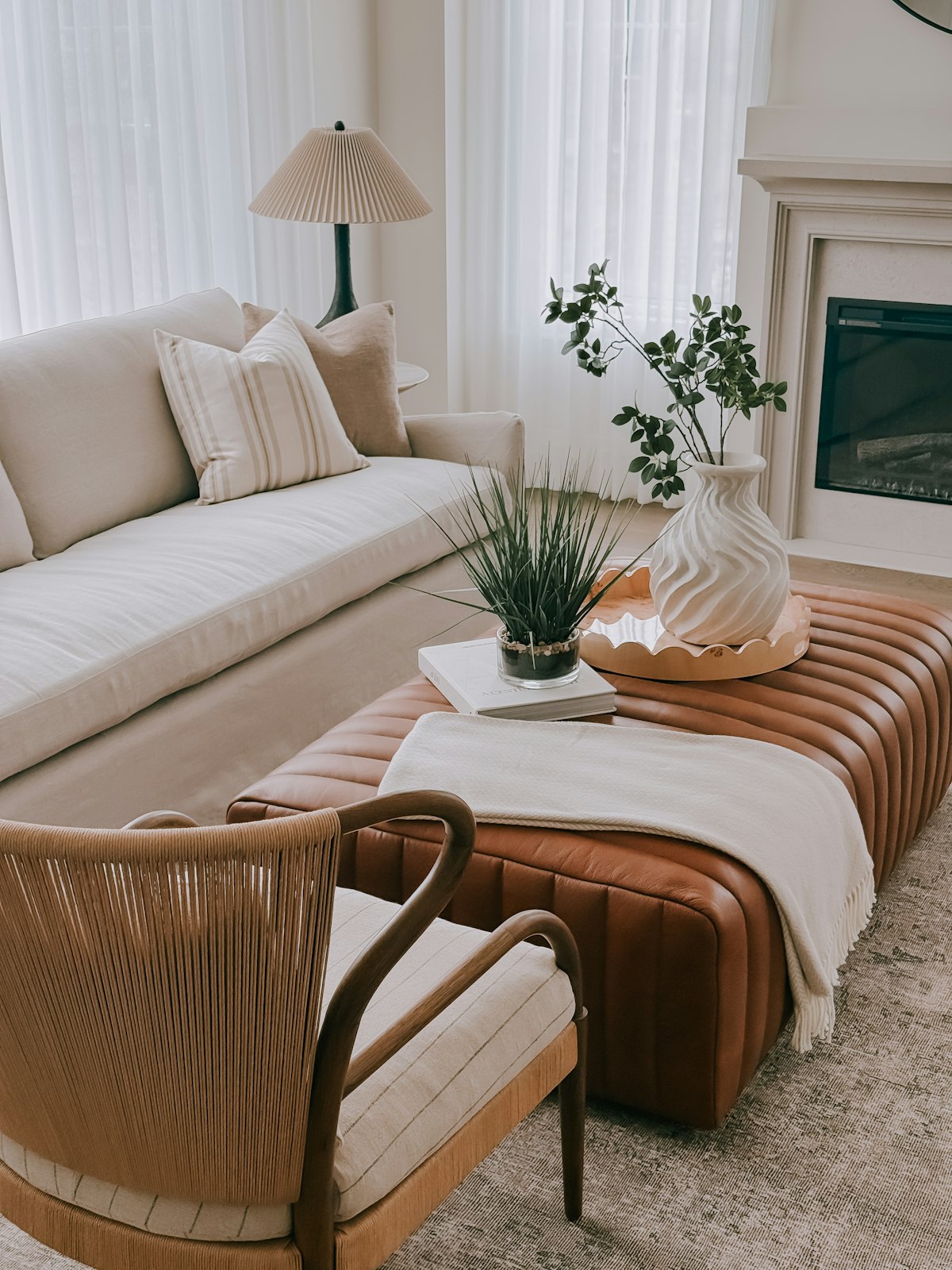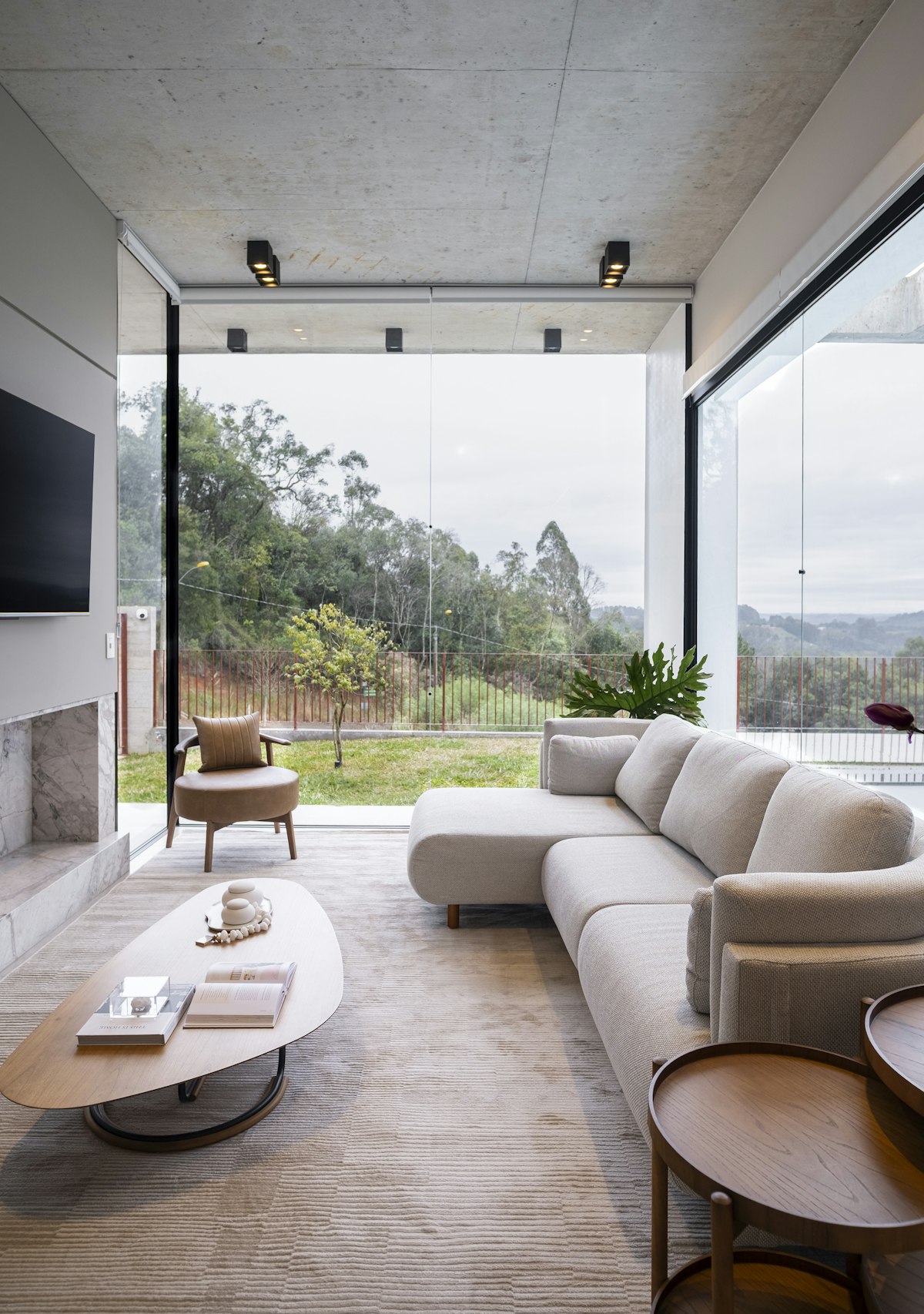
Choose an accent that works with the largest existing surfaces and repeat it in a few deliberate places. The repetition does not need to be identical in shade or texture. A cushion, artwork detail and small object can connect without becoming a matching set.
Keep enough quiet background for the accent to stand out. If every object competes for attention, reduce the number of strong colours before adding another. Compare fabric samples under both daylight and evening lighting.
Try small reversible changes before committing to a large upholstered piece or painted cabinet. The accent should support the mood you want and the objects you already own. A controlled colour relationship can make a mixed collection of furniture feel more cohesive.
Choose the accent in relation to what will remain in the room. A colour found in artwork, a rug or an existing textile can provide a useful starting point because it already has a reason to belong. Compare it with the sofa, floor and wall before buying more objects. The accent does not need to be the brightest possible shade. A muted but distinctive colour can create a clear relationship without making every small item demand attention at the same time.
Vary the way the colour appears rather than repeating identical products. A woven cushion, a painted detail in artwork and a glazed object can share a colour direction while behaving differently in light. This gives repetition some depth. Avoid collecting an entire matching range just to make the scheme recognizable. The room can feel connected through a few well chosen echoes, allowing the existing furniture and meaningful belongings to keep their own character.
Judge the amount of colour from the main view of the room. Several modest objects can combine into a strong presence when placed close together, while an accent on the opposite side may help connect an isolated corner. Move existing pieces before buying additional ones. Consider empty areas as useful pauses rather than evidence that another coloured object is needed. A restrained distribution often gives the selected shade more clarity than an equal spread across every surface.
Test the colour under normal lighting. Fabric texture and sheen can make two apparently similar samples look noticeably different by evening. A large upholstered piece commits much more of the room than a cushion or throw, so begin with reversible changes when uncertain. Give the arrangement time to become familiar. The goal is a relationship that feels comfortable during ordinary use, not a temporary burst of novelty that depends on replacing the whole collection when preferences change.
Keep usefulness alongside the palette. A cushion should improve comfort, a lamp should provide suitable light and a storage box should hold something worthwhile. Buying objects solely for their colour can create the clutter the scheme was intended to organize visually. Remove items that have no practical or personal reason to remain. A successful accent colour makes a mixed room feel more coherent while allowing the household to use its furniture without protecting an elaborate decorative arrangement.
Measure your own room and check furniture, fixing and care instructions before buying. Have heavy wall mounted items and permanent electrical changes assessed by competent professionals where the installation requires it.